One Room Challenge Link Up- Week 5 of the Client Kitchen Remodel

Greetings!

Welcome to Week 5 of the ORC link up!  If you are new to my blog, click here for the beginning of this 6 week challenge and the details about the creator, Linda, of Calling It Home.


So, we are on the home stretch, and frankly, it has been smooth sailing!  I feel so lucky to have such amazing clients and such a satisfying project!

This week we got the light fixtures installed along with the hardware for the cabinets.

Here's a sneak peek:


I'm loving the industrial looking pendants and the semi-flush mount ceiling fixture.  The former ceiling fixture looked like this:


I'm not a huge of fan of flush mount lighting -- and that's why we went with a semi-flush mount.  It adds a little depth and dimension to the ceiling and doesn't compete with the pendants.

I can't wait to show you the final reveal next week!

Cheers!

Check out the other participants here.

Embracing Art Deco - Design in a historical home


One of the great things I love about living and working in the San Francisco Bay Area is the opportunity to work on historical homes.

For the last several months, I've been working with the owners of this lovely Art Deco style home that was originally built for the 1939 San Francisco World's Fair (also known as the Golden Gate International Exposition).


This home was a stop on a model home tour during the 1939 exposition and it retains much of it's period tile work, light fixtures and interesting details.


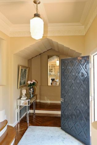
This entry photo features the original hand carved front door, greek key moulding, waterfall light fixture and herringbone hardwood flooring.  Incredible isn't it?


We've been working on transforming the dining and living spaces and we're almost done.  I thought I'd share what we've been doing in the dining room.

We started with this light fixture from Cyan Design.  Love!

(I instagrammed it here)

 My clients fell in love with the art of Lu Beury and we added a painting (similar to this)
To balance this bold art on the opposite wall, and to fill another large space without putting up something that would compete with the painting visually, I found these awesome (and affordable!) framed agate pieces from ShopTen25


Here's a design board of how the space is coming together:


Stayed tuned!


One Room Challenge Link Up - Week 4

Welcome to Week 4 of the One Room Challenge, created by Linda from Calling it Home.  She's challenged talented designers and invited those of us in the blogosphere to create a room transformation in just 6 weeks.  

I am working with a client on a kitchen renovation.  The renovation is taking place within the original footprint of the kitchen and we are working with a moderate budget.

Click on these links to catch up if you've missed the last 3 weeks.

This week we focused on finding counterstools, finalizing paint colors for the cabinets and the walls, confirming hardware, lighting and refinishing the floors!

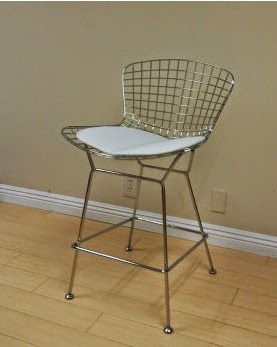
We ended up going with these super affordable counter stools from EZMOD.


(via the EZMOD website)

And BTW, EZMOD has excellent customer service!  One of the bases arrived damaged and they sent a new one, lickety split!

The options for the stain on the hardwood floors were presented:


A sneak peak of the painted cabinets:
(blue tape is being used to open them since the hardware is not here yet!)


And just to recap, this is the kitchen before:


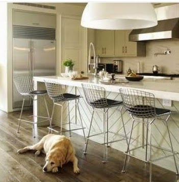
And this is one of our inspiration photos:


We're getting there!

Tune in next week!

Check out the other participants here.

Cheers!


One Room Challenge Link Up Week 3 - Kitchen Remodel

Welcome to Week 3 of the One Room Challenge Link Up!

The kitchen remodel is buzzing along nicely!

If you missed the last post click here.

We've had the carrera marble countertops and the tile backsplash installed!


Note, we changed out the electric burners (see below before) for a sleek black cooktop.


We ran the tile up the inside of the kitchen window frame:


And this newly installed faucet is a little (aka BIG) jewel in the kitchen!


You can find a similar faucet here.

We've selected the cabinet paint color and we had the painter paint one to make sure it works.....


Phew!

Still to do:

Paint Cabinets
Finalize Hardware
Install cooktop hood
Pick wall color
Install Lighting
Select counter stools

And off we go!

Check out the other Link Up participants on Calling it Home!


Week 2 of Kitchen Remodel - One Room Challenge Link Up

Hi there!

Well it's been a busy week!  If you missed last week's post about the challenge of remodeling a kitchen in 6 weeks, click here for Week 1.

The kitchen started out like this:


And here it is today:


The overhead hanging cabinets have been removed, and the doors and drawers of the existing cabinets have all been replaced with shaker style fronts.  It's amazing how much more light and airy the kitchen feels without those hanging overhead cabinets!

Extra storage was needed in this tiny kitchen, so we had the cabinet maker create some more space:


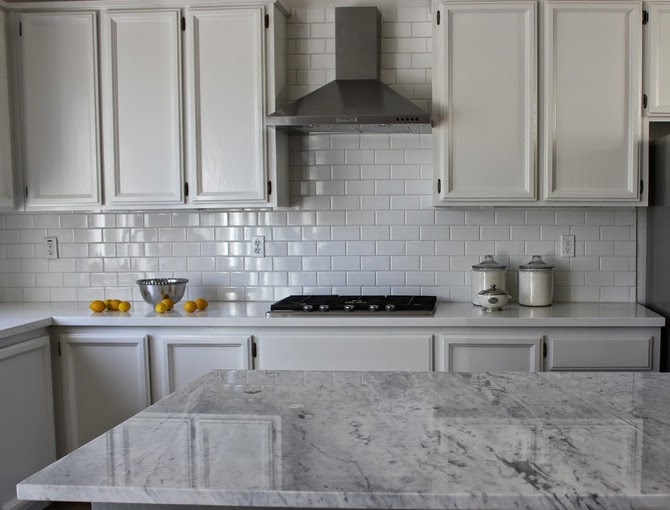
Our plan is to have carrera marble countertops, white cabinets and a white tile backsplash like this:


The linoleum floor will also be replaced by hardwood flooring and I'm excited about the new lighting that will be installed.

I created this design board for my clients with some ideas about how it will all pull together:


Next week we hope to have the carrera and tile installed!  

Be sure to check out all the ORC Link Up participants at Calling it Home!

Stay tuned!