Quartz Kitchen Counter LOVE! Before & After Kitchen Remodel

Hi there!
I thought I'd share a "before and after" of a kitchen renovation that I just completed for a client in San Francisco.
It's a petite condo in the Marina District that has a beautiful view of the Bay Bridge and of Alcatraz.

Here is the "BEFORE" pic:

This photo was taken with my iphone right before demo, so of course it's not the greatest.


Oak cabinets, parquet wood floor (partially demo-ed here in this pic), white tile, and a fridge that stuck out about 6 inches past the counter, made this small kitchen look even smaller.


And now for the "AFTER":

The overhead hanging cabinets were removed on one side, which made a huge difference in light and airiness in the space.

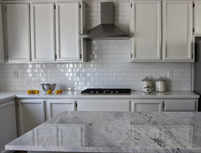
The countertop is a beautiful quartz called Quartz Concerto, and the counter is 2 inches thick instead of the usual 1 1/2 inches, which makes for a fresh and contemporary look.


The new refrigerator is now counter depth and the 2x8 subway tile add a simple and light backsplash.  We used shaker style doors with oversized hardware for visual impact.


We chose Quartz for this project because of it's durability and because it does not require sealing, re-polishing or reconditioning.

I just love the way this kitchen turned out!


Cheers!

One Room Challenge Link Up- Week 5 of the Client Kitchen Remodel

Greetings!

Welcome to Week 5 of the ORC link up!  If you are new to my blog, click here for the beginning of this 6 week challenge and the details about the creator, Linda, of Calling It Home.


So, we are on the home stretch, and frankly, it has been smooth sailing!  I feel so lucky to have such amazing clients and such a satisfying project!

This week we got the light fixtures installed along with the hardware for the cabinets.

Here's a sneak peek:


I'm loving the industrial looking pendants and the semi-flush mount ceiling fixture.  The former ceiling fixture looked like this:


I'm not a huge of fan of flush mount lighting -- and that's why we went with a semi-flush mount.  It adds a little depth and dimension to the ceiling and doesn't compete with the pendants.

I can't wait to show you the final reveal next week!

Cheers!

Check out the other participants here.

One Room Challenge Link Up - Week 4

Welcome to Week 4 of the One Room Challenge, created by Linda from Calling it Home.  She's challenged talented designers and invited those of us in the blogosphere to create a room transformation in just 6 weeks.  

I am working with a client on a kitchen renovation.  The renovation is taking place within the original footprint of the kitchen and we are working with a moderate budget.

Click on these links to catch up if you've missed the last 3 weeks.

This week we focused on finding counterstools, finalizing paint colors for the cabinets and the walls, confirming hardware, lighting and refinishing the floors!

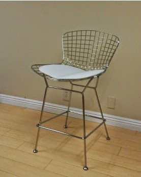
We ended up going with these super affordable counter stools from EZMOD.


(via the EZMOD website)

And BTW, EZMOD has excellent customer service!  One of the bases arrived damaged and they sent a new one, lickety split!

The options for the stain on the hardwood floors were presented:


A sneak peak of the painted cabinets:
(blue tape is being used to open them since the hardware is not here yet!)


And just to recap, this is the kitchen before:


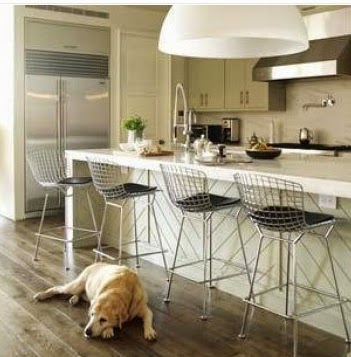
And this is one of our inspiration photos:


We're getting there!

Tune in next week!

Check out the other participants here.

Cheers!