One Room Challenge! Linking it up!

Hi all,

I'm so enthused to be able to share that I am joining the One Room Challenge (ORC) as a linking participant.
Linda from Calling it Home created the ORC as a motivational and inspirational six week challenge to get one room designed and finished.  She's invited 20 bloggers, and then spread the love by allowing those of us who would like to link up to participate as well.


So, what is my One Room Challenge?

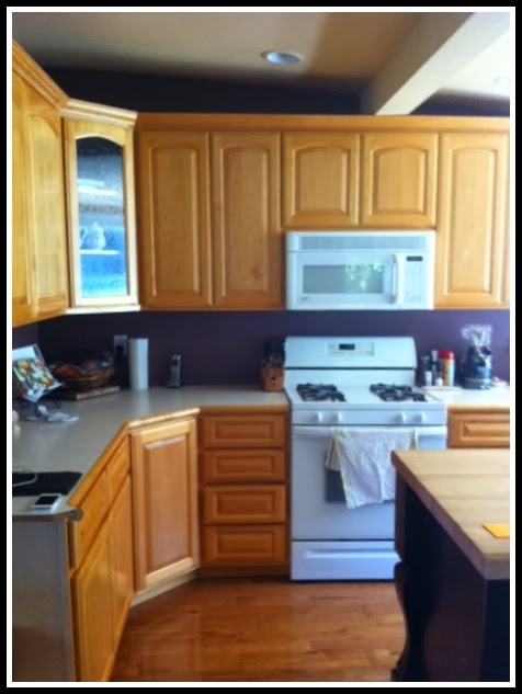
It's a client's kitchen, that we are going to endeavor to modernize without changing it's footprint.

Here it is before:


What's our goal?

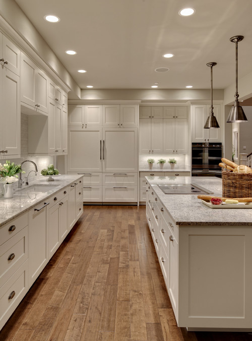
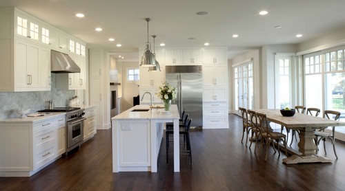
Here's our inspiration:


Traditional Kitchen by Minneapolis Architects & Designers Charlie & Co. Design, Ltd


We're planning on removing the overhead hanging cabinets, painting and refacing the existing cabinetry, replacing the formica with carrera marble slabs, adding a backsplash, new lighting, upgrading appliances, eliminating the vinyl flooring and replacing with hardwood....and creating overall pizazz!

All within a moderate budget!  

Stay tuned for next week!



Before and After: Residential Staging

So, I thought I would share a few details about how I work with staging homes for resale.  I had some great feedback from this 'tray of the day' post the other day.......


And the living room.....


But there is more to the story.  When I first met with the real estate agent, the living room and dining room looked like this.... (I always take iphone pics when I'm meeting with clients, so sorry for the fuzziness)


(and please, I am not trying to negate the style and manner in which the homeowner lived -- as real estate staging is not quite like real living!  My intention with this is to describe the marketing process of the home.)

I specified new paint colors and new carpeting for these adjoining rooms.  And then staged them to work well together visually.


This whole house has a mid-century modern vibe and I loved the clean lines of the kitchen...
 (before...)


But I had the homeowners paint the bottom cabinets a Benjamin Moore gray, add new hardware and put in canned lighting which pumped up the space without spending a ton of money.....


The family room is not huge and had an interesting shape.  Here it is before:


And after:


To add depth to the built-in bookcases, I had them paint the back of the cabinets a light gray (and..... are you noticing the black and gray theme I've got going in the house?  It's to create a visual flow....)


Oh, and of course, there's another 'tray of the day' on the family room table!


So that's it.  That's a little snapshot of the preparation of a home before it goes on the market.

I hope it's inspired you!

Cheers!

Oh, I linked up at Serenity Now!

P.S. Please 'like me' on facebook!  I post lots of great little finds and tips that you will love!


Styling a Bathroom Countertop


I'm a minimalist when it comes to what's on my bathroom countertops.  I like clean....utilitarian...... but, visually interesting things in my bathroom.

This bathroom was designed by my friend Kelly Scanlon (beautiful, isn't it?), but when it came to the photo shoot, she asked me to help style it up.


That's where Anthropologie and ZGallerie, came in.

How cool are those tassled towels?

Find them here.


The faux air plant is from Z Gallerie -- Love!


The (above) geometric containers from Anthro are sold out! (Sorry!) But here are some similar items that would do the trick:


Or these:


What about you? Are you a minimalist on your bathroom countertop?

Cheers!


How to reupholster....

I treated myself to a little gift....


I'm loving this book by Amanda Brown of Spruce.


(And you have got to look at her living room that she showcases in the book, you can get a sneak peak in the book preview -- it's swoon worthy!)

My obsession with upholstery started 3 years ago when I took a class from a local community college.  After that, everything else has been self taught (by trial and error), youtube, or by studying the video that I purchased from the Spruce website.


Cheers!

Before and After - Kitchen Mini Makeovers

I had two clients recently whose kitchens needed a mini-lift for resale.  Neither client wanted to put a ton of money into the kitchen (because they were selling their house), but both wanted to make their kitchens 'pop' when shown to prospective buyers.

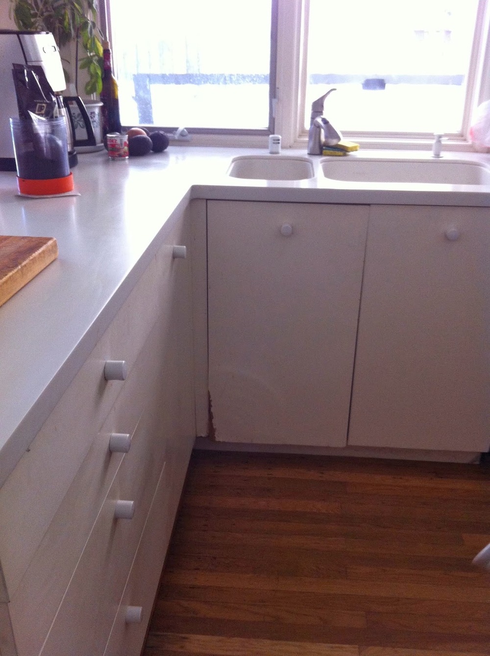
Here's the first kitchen, before...


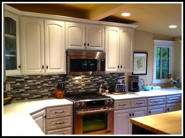
The cabinets were painted to blend with the corian countertop, and we added hardware to the cabinetry.  New oven and microwave  -- but the FAB part was the AFFORDABLE tile from
 HOME DEPOT (only $190 folks) that we added to the backsplash area!

After..


For more info on this house, click here.

Here's number two before and this was a quickie fix......


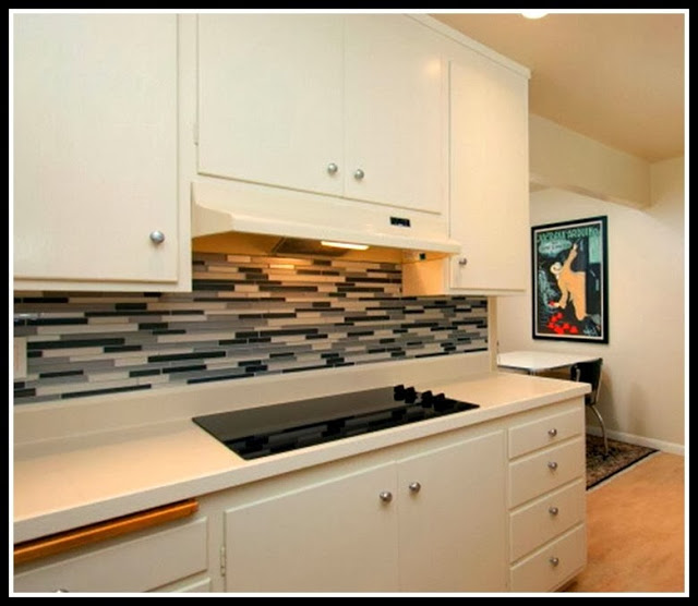
The cabinets and countertops were neutral enough, so we decided not to paint or replace them.

Instead, we opted for a new cooktop and again, a glass tile backsplash.  


Click here for more info on this little ditty.

I just love how a little glass tile can make a dated kitchen look glam!

Both properties sold lickety split!

Cheers!