I always love looking at "before and after" photos of interior design, don't you?
They give me such inspiration!
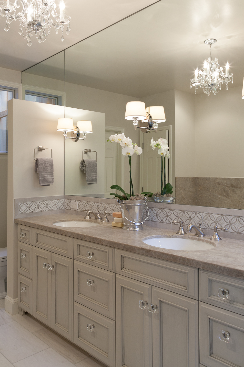
This was a master bath renovation that was completed for a client in San Francisco. We kept the footprint of the room the same, but replaced all the cabinetry, flooring, tile, tub, fixtures, etc.
Here is a before picture of the space:
The homeowner's wanted a fresher look, and also wanted to lighten it up as the there are just two small windows in the space.
We mirrored the entire side of the vanity wall to reflect more light. It goes from floor to ceiling on either side of the vanity (behind the privacy wall on the left and adjacent to the shower on the right). Custom glazed cabinets are jeweled with square glass knobs which added a bit of luxe to the design.
Photography by Kathryn MacDonald Design by Price Style and Design
Adding a dainty chandelier and sconces above the vanity continued to bring in more light to the space (and a little glam too!)
Oversized mosaic tile accents were inset into the floor and shower niche to mimic the backsplash and tile insert.
Photography by Kathryn MacDonald Design by Price Style and Design
And that's the story! Thanks for stopping by!
Contact me if you need help with your space!


