"Kid Friendly" Family Room Reveal

Hi there!  I was finally able to run over to see one of my fave clients on Friday to snap a few photos of the family room that we completed a few months back and I thought I would share it with you! 

Here it is!!!


My clients are a young family with two little girls.  The goal was to create a room that was sophisticated but very kid friendly.

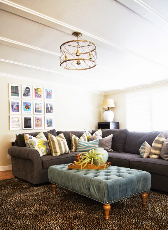
Aqua, Gray and Yellow Family Room


The design plan included a cheetah print rug because it would be so forgiving if anyone spilled food or beverages on it.  Sourced at a local carpet shop, we had a custom size cut and bound in black tape. We chose a large sectional from Pottery Barn in a dark fabric (again, to hide any potential spills or stains) and then added brightness with a tufted aqua velvet ottoman from World Market and pillows from Etsy.

I love to use polyvore.com to create design boards for my clients.  It really helps people visualize how things are going to look.  I sent my client this board with my decorative pillow suggestions for the sectional and she was able to purchase them directly from the fabulous pillow fabricators on etsy.

Etsy pillows for JD


The room called for a large media cabinet to run the length of one wall -- so we got two cabinets from Ikea and then mounted some fabulous hardware on the front of the doors to glam them up.


Isn't it amazing how hardware can make such a difference?

One other little jewel that we added to the room was a pretty light fixture from Shades of Light.  


The ceilings are 8 feet high and we selected this trellis chandelier because it was light and airy looking. We hung it close to the ceiling with only one or two links of chain so that it would look like it was meant to be a semi-flush mount fixture.  It's one of my favorite additions to the room!


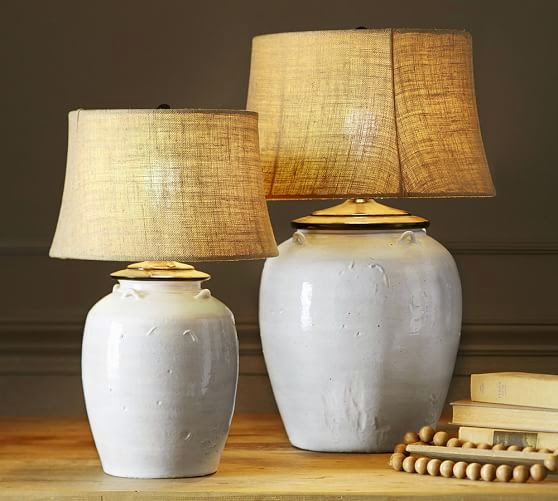
The other light source comes from two lamps on tall cabinets that flank the windows on either side in the back of the room.  You can see one of them behind the sofa in this photo.

The lamps came from Pottery Barn.


The room was completed with a "Tray of the Day".  (Follow me on instagram @pricestyleanddesign to see a variety of other tray vignettes).  Trays are so fun to style!


Thanks for stopping by!  Please email me if you would like to hire me to refresh your space!
pricestyleanddesign@gmail.com

Cheers!


Secrets from a Real Estate Stager - 9 Tips for Staging/Selling Your Home


Why stage your home for resale? Well, the answer is, in my experience, you will get more money for your home.  I have seen it time and again that when a house is well staged, it becomes a more valuable commodity. Staging helps potential buyers see the 'flow' of the home with regard to seating, foot traffic, watching TV, working from home, etc.  I like to tell my clients that staging your home is like putting on a really great outfit for a job interview.  Sell your home like you would sell yourself to a potential employer.  Present a polished first impression.  According to Barbara Corcoran (real estate mogul and NBC Today Show contributor), "buyers decide within 8 seconds whether they are interested in your home".

While there are many 'tips and tricks' on Pinterest and other sites telling you how to prepare your home for market....I thought I'd share my tried and true formula for presenting your home for resale.

TIP #1:  Hire a GREAT REALTOR!  Do your research and interview at least 3 realtors that have been successful in your area.  Ask for references.

TIP #2:  Let the realtor do their job.  Yes, I know I'm not even talking about staging yet, but so often I see homeowners trying to tell their real estate agents what they think their home is worth and how it should be presented.  You hired a real estate professional for a reason.  Let. them. do. their. job.

TIP #3: Let the real estate agent find a stager.  More than likely, the agent has a stager or two that they work with on a regular basis.  Again, this goes back to 'letting the agent do their job'.  Stagers and agents need to work in simpatico to make the home marketable to the best target audience.

TIP #4:  Now we get to staging!  Preferably, if you can move out of your home during the selling process, that is the best option.  Because 'living in a home' is not quite like 'staging a home'.  If you end up living in the home while it is staged, then be forewarned that sometimes the stager has a different interpretation of how the living spaces will be presented. The stager's job is to create an artistic representation of life in the home for the target market.

TIP #5:  Now on to my tried and true staging tips.  Color Schemes.  It's important to create a visual flow for the potential buyer as they walk through the home.  For each home that I stage, I first create a color scheme that will be carried through each room of the house. From furniture to area rugs, and pillows to decorative accessories, each room and all the pieces work together to tell a unified story. People respond to color.  Color helps people remember the individual rooms or differentiate between the myriad of homes that they are looking at to purchase. Color evokes emotion and creates a memorable bond with the home.

Green color scheme:


Yellow color scheme:

Red color scheme:

TIP #6:  Let. the. stager. do. their. job.  A few times, though not many, after I've finished my job, the homeowner will come in and say something like..."I hate green!" -- and I've just staged the whole house with a green color scheme.  To them, I say (politely), "it's not about you anymore -- this is a house that is going to be sold and it is no longer your home".  That sounds harsh (I do try and say it in a much nicer tone believe me....) but it's true.  Let. the. stager. do. their. job.

TIP #7:  Not every nook and cranny needs to be staged.  If you are living in your home during the selling process -- then eliminate everything you possibly can that is personal.  Pack up or edit items that are on bookshelves, clear off the clutter on the counters, etc. The potential buyer needs to see the 'space' instead of your 'stuff'. I like to create artful compositions on bookshelves, counters or coffee tables that will be remembered instead of visual clutter.


TIP #8:  Respect the staging process.  Some people confuse 'staging' for 'interior design'. While there are similarities (yes, creating beautiful spaces), staging occurs within a 1-2 day time frame, using the stagers existing inventory, while with interior design, one has the luxury of time to slowly build and layer room by room.  Every home I've ever staged, needs something that I probably don't have in my inventory.  I either have to buy it or rent it from another source.  The staging process happens so quickly, and often times the day of staging is what I call 'a work in progress' -- I bring things in and place them, then revise, revise and revise until I'm done at the end of the day.  I encourage my clients NOT to show up in the middle of the day to see what I'm doing -- because at the end of the day it will most likely be different!

Beginning of a typical staging day (bringing in the furniture):

Middle of the day, editing and organizing:

Final at end of the day:


TIP #9:  Breathe.  Inhale and exhale.  Seriously.  Selling your home is one of the most stressful things that you may go through in life. (Click here to read more about that!)

Cheers!

(All images are the property of Price Style and Design)

Affordable Original Art -- 6 ways to jumpstart your collection


Have you ever wanted to own original art but thought that art collecting was only for the rich and famous?  Many people think that buying original art is too expensive, but I disagree!

If you've been reading this blog for a while, you know that I like to promote the acquisition of original art for home design.  You've got to start looking locally in your area, researching the type of art that inspires you, or even venture to create your own!

Here are 6 ways to curate a beautiful art collection in your own home...


1.  LOCAL GALLERIES
Check your area for galleries featuring local artists.  Often times they are called 'artist studios', and some areas even have what's called 'open studios', where art is displayed in private residences.  Prices are usually very affordable and you may even have a chance to meet the artist at one of the venues, which would be wonderful!

Special Bonus:  Some galleries let you 'rent' the art for a period of time to see if you really, really love it in your home!

In San Francisco, we have the Museum of Modern Art Artists Gallery (which is located at Fort Mason and not in the museum downtown), where artists are carefully vetted before their work is selected -- and the prices are amazing!


2. FLEA MARKET
Flea markets are an awesome way to find vintage art, and integrate it into your collection.  Look for similar colors and hues and create a gallery wall with your finds.

(via)

3. CRAIGSLIST.ORG
You might be shaking your head at this one, but I recently scored an awesome original painting by one of my favorite artists, Michelle Armas, on Craigslist in San Francisco for a FRACTION of the price.  

To search on craigslist, type in 'original art' in the search area and then click 'gallery view' - so that all the photos come up and you can search quickly by what catches your eye!  

(This is the Michelle Armas painting that I scored on Craigslist!)


4.  ETSY
Etsy.com has become one of my top choices when sourcing affordable art for my clients.  The easy way to search, is to type in the genre (abstract, figurative, impressionist, etc.) and then add in the color and size for which you are looking.


5.  DIY 
Choose colors that you love (or create a color scheme using color theory) and then go for it. :)


(This is a little series of paintings that I've been working on.....)

6. ONLINE SHOPPING
This, my friends, I could do for hours!  Google, Pinterest, Houzz, Blogs....the list goes on and on, in terms of ways to search for original art.  What inspires you?  Color, concept, history, shapes, animals, light, landscape, culture.........the ideas are endless!

Personally, I'm a huge mid-century modern fan, and my favorite gallery is Lost Art Salon in San Francisco.  They have a FABULOUS website, here

As luck would have it for my readers, Serena & Lily curates much of their art collection from my friends at Lost Art Salon, so you can view more beautiful images, here.


I hope this has inspired you to find art that you love!


Decorating a Teenage Girls Bedroom

Price Style and Design Project:  Teenage Girls Bedroom

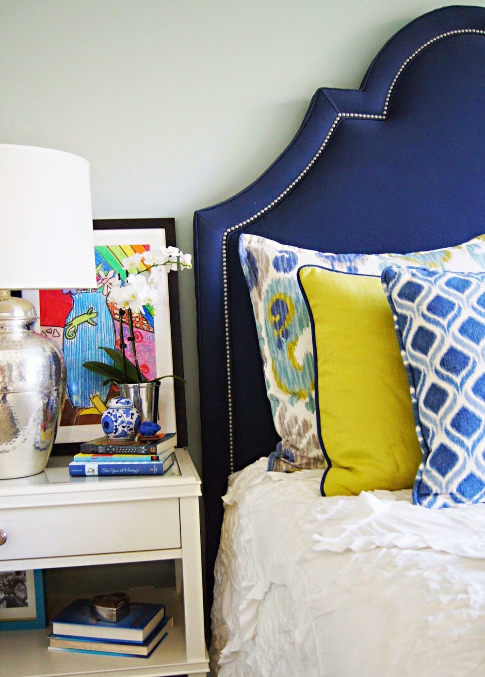
Yesterday's blue and white post, inspired me to edit and share these photographs of a recent project I finished. The combination of navy and chartreuse creates a vibrant impact in this recently completed teen girl's room!


We started with the Rivulets Quilt from Anthropologie -- a wise investment for a girls' room, as it's washable!!!  Navy ikat and chartreuse custom pillows were layered in along with a custom made headboard from Nathan Anthony Furniture.

The lamp and side table are from Pottery Barn -- super affordable.


This lucky teen has an ensuite bathroom and the walls were papered in Feather - Denim from 


While the art on the bedside table was created by the teen herself, the art on the wall in the bath was purchased from the fabulously curated and ever changing original art collection at Serena & Lily.


And there you have it!  Thanks for stopping by!


Cheers!


Quartz Kitchen Counter LOVE! Before & After Kitchen Remodel

Hi there!
I thought I'd share a "before and after" of a kitchen renovation that I just completed for a client in San Francisco.
It's a petite condo in the Marina District that has a beautiful view of the Bay Bridge and of Alcatraz.

Here is the "BEFORE" pic:

This photo was taken with my iphone right before demo, so of course it's not the greatest.


Oak cabinets, parquet wood floor (partially demo-ed here in this pic), white tile, and a fridge that stuck out about 6 inches past the counter, made this small kitchen look even smaller.


And now for the "AFTER":

The overhead hanging cabinets were removed on one side, which made a huge difference in light and airiness in the space.

The countertop is a beautiful quartz called Quartz Concerto, and the counter is 2 inches thick instead of the usual 1 1/2 inches, which makes for a fresh and contemporary look.


The new refrigerator is now counter depth and the 2x8 subway tile add a simple and light backsplash.  We used shaker style doors with oversized hardware for visual impact.


We chose Quartz for this project because of it's durability and because it does not require sealing, re-polishing or reconditioning.

I just love the way this kitchen turned out!


Cheers!