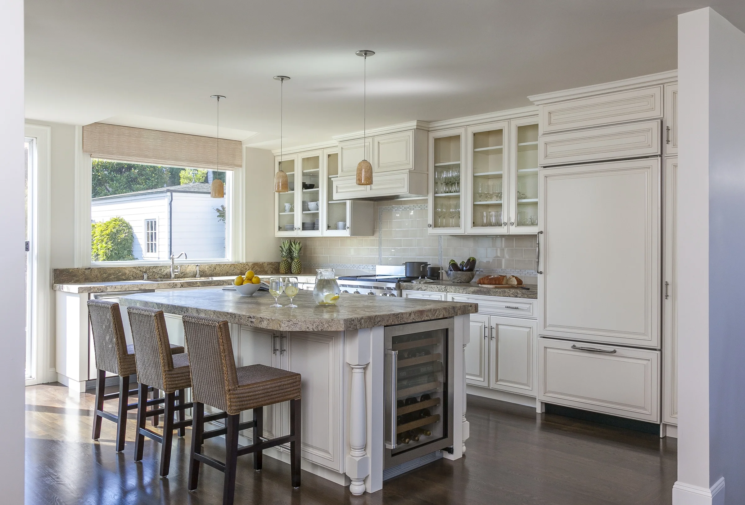
Hi there! Today I thought I'd share a before and after of a recent San Francisco kitchen design and remodel project.
The homeowners asked me to help them design and remodel their kitchen to give it a more family friendly design, inviting for entertaining and to create more storage. This is what it looked like before:
It wasn't horrible by any means, but the island was too shallow for seating, and there wasn't a ton of storage. The windows flanking the hood looked out directly to the neighbor's house and didn't provide any of the beautiful San Francisco views, so my clients felt the windows were unnecessary.
We decided to make some changes and these were our plans:
We solved the design dilemmas that this kitchen faced by blowing out the wall to the right of the island and adding upper cabinets where the existing windows were. While keeping the L-shape of the large counter space, we increased the size of the kitchen island, adding more depth to allow for seating and additional storage.
We kept the look bright, by adding a neutral toned glass tile backsplash to help reflect the light from the large remaining window and sliding glass doors. Take another look:
Photography by Kathryn MacDonald Design by Price Style and Design
The flow of the kitchen is open, airy, bright and happy!
Photography by Kathryn MacDonald Design by Price Style and Design
If you need help remodeling a kitchen, please contact me!
Thanks for stopping by!


